Searching through logs becomes ineffective when unknown unknown abound and data volume grows. Log visualization is key to help navigate large data volume. In most modern screens, one can easily display 50-100 lines of text comfortably for viewing at a time. Anything more gets hard to read. This is what we call as the “50-100” rule.
My simple-minded laptop generates 4,000 Syslog lines in 15 hours. One would need to make 40-80 clicks to scroll through 4,000 lines of logs if I was looking to find something anomalous! Logging scale issues increase even more if it were in a cloud or corporate environment, due to the sheer number of machines running applications that are continuously operating and generating log data.
So, how do we make it easy for a user to go beyond the 50-100 lines. We don’t necessarily mean they can read all of the lines beyond the 50-100, but can there be visual representations that make it easy to navigate large amounts of text for specific purposes?
Here’s an example of viewing more lines on the display outside of 50-100 lines rule. The Sublime text editor has a zoomed-out code area or mini code map section at the right-hand side. A user would use the mini code map section to explore large amounts of code using this minified side view where a user can jump to parts of the source code with ease. Notice that the visual representation here is not for the user to read all of the code but acts as an assist is faster code navigation.
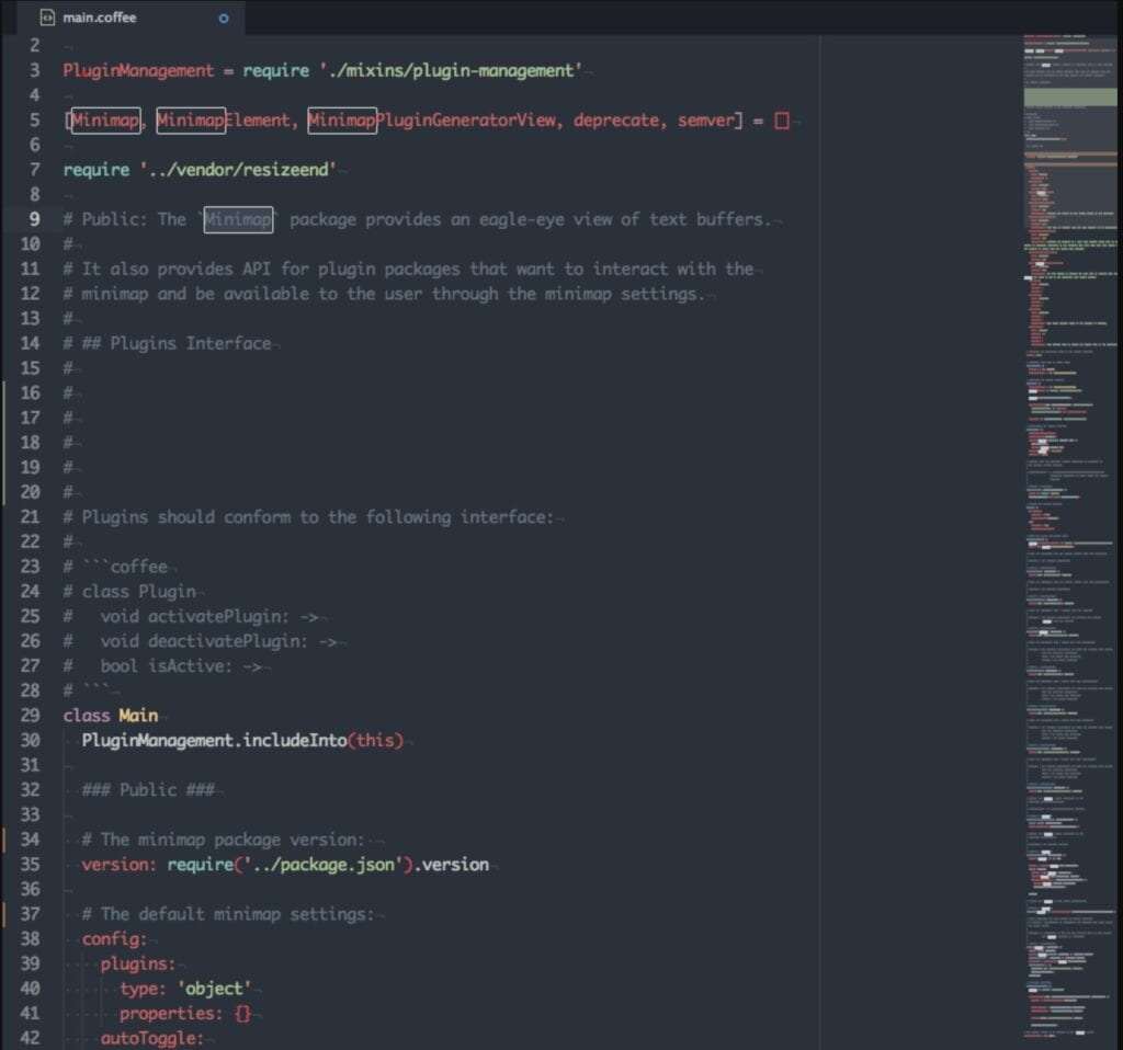
Sublime Text Editor with Minimap Example
While Sublime’s mini code map display has a beautiful code navigate feature, it does not serve log text visualization well for several reasons:
- Log text doesn’t have a fixed format and fixed color labeling.
- Log text workspace is too big to be handled by the editor 10-1,000 thousand’s text lines.
- Unlike the metrics plot, minimap does not aid the user to visualize for logging anomalies
Eyeballing through log lines is analogous to examining metrics data points manually and not using a visualization tool such as a simple X-Y plot. Using the plot tool appropriately, without being an expert at the data, one can easily pick out unusual data activities such as unexpected bursts or discontinued segments. What if a user could see logs the same way? In general, human beings do better when visual cues are present.
So here’s an idea: we are going to plot a log as a dot in a graph just like you would plot a dot for a metric like a CPU utilization metric. An operator then uses it to isolate log abnormalities visually. What would this look like ? How would such a system work? That’s for a different article, I suppose.