Why do you keep logs? Regardless of the type of logs we’re talking about, you keep them because you expect them to provide some value for the organization. Maybe the logs will help you improve profitability; perhaps they will help you recover from downtime or perhaps they are expected to alert you to a security incident in progress. If you’re a system administrator or someone tasked with infrastructure reliability and maintenance, you’d agree that logs are critical. They represent the source of truth you go to for information about your server status and activity, website traffic, application performance and much more.
No matter the intended purpose of logs or how you use them, the information in these logs should be easy to access and interpret. Today’s complex systems generate enormous amounts of log data, making it almost impossible to dig through tons of data in raw text files to find important information. Finding valuable information is immensely difficult in text logs but not in the visual world. This is precisely where log visualization comes into play. What if the data in your logs could transform into graphic shapes and patterns? Wouldn’t it be much easier and faster to decipher information from log data and understand it better?
What are Logs, and What are They Used For?
Before going any further, let’s make sure everyone is on the same page about the meaning of logs. A log is a textual, timestamped record that tells us what happened and when. DevOps engineers have to rely on a combination of logs from various system components and data sources to understand why an event occurred, and perhaps even predict future events.
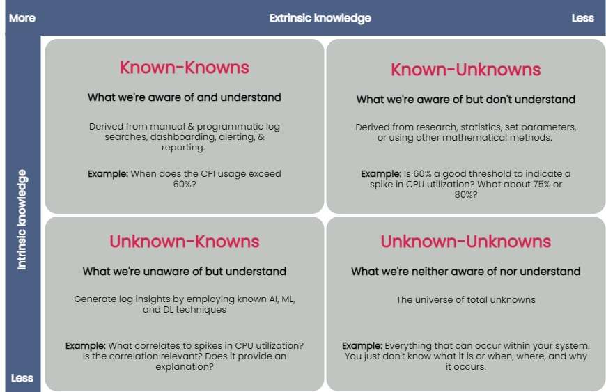
You can taxonomize knowledge extracted from log data into four key groups: known-knowns, known-unknowns, unknown-knowns and unknown-unknowns. Manual and programmatic log searches, dashboarding, alerting and reporting manually extracted log fields are common ways to extract and analyze known-knowns. These methods assume that the engineer is already familiar with the data and knows where to look for answers. You can use statistics or other mathematical means to algorithmically resolve the known-unknowns, such as search terms and thresholds. The unknown-knowns are taken care of using AI/ML/DL techniques that generate log insights such as event correlations, log pattern clustering and known anomaly detection. But what about the unknown-unknowns?

Uncovering Unknown-Unknowns
With raw text logs, it’s relatively simple for engineers to conduct machine searches or set alerts upon encountering certain specific errors or specific types of behavior. However, to search through logs or even set up alerting parameters requires you to know what you’re looking for. If you have no idea what kind of errors or threshold limits for which you need to be alerted, it’s impossible to set these up.
Modern applications are incredibly complicated, and one can not honestly understand everything about how they work or even always ask the right questions when things go wrong. But if an engineer reviewing logs doesn’t even know what to search for, it becomes impossible to figure out without an assistance tool like a purpose-built log visualization solution.
For the most part, none of the techniques used to uncover the known-knowns, known-unknowns, and unknown-knowns of log data can help reveal the unknown-unknowns. An effective way of unraveling them is to rely on human intelligence to explore the unknown-unknowns space. Supplementing human intellect with a purpose-built log visualization tool can significantly help analyze the unknown-unknowns. Once you’ve recognized the unknown-unknowns, you can quickly feed this knowledge back into the appropriate, less esoteric groups (known-knowns, known-unknowns and unknown-knowns) and get more value from your log data.
A good log visualization tool can aid in gathering knowledge from unknown-unknowns and can inform proactive log analysis or fast reactive log analysis use cases. Current log analysis practices center around reactiveness; the focus is to minimize and resolve issues after a problem has occurred. Using a log visualization tool, you can quickly isolate subtle and anomalous changes within a system by visualizing patterns generated from log data and exploring unknown-unknowns before an incident occurs.
Current log visualization tools are limited in display log count distribution and its variations. They do not visualize other log attributes or log combination attributes.
All the UIs shown have similar function usage and displays. Drilling into an example of UI windows gives one the feeling of a typical log analytics practice. The figure below annotates different log analysis functions in the labeled, boxed area. None-visual log analytics functions such as search, tag, and log display are all required time-range input.
An ideal log visualization tool should not rely on just one information type. Log data is multifaceted. A log visualization tool can only begin to be valuable when it lets you focus on as many facets of log data as you can derive.
Log Visual Pattern Discrimination
The power of log visualizations comes from humans’ ability to recognize visual patterns. It’s hard to spot a pattern among raw log data, but it becomes easier once you can visualize that data.
When an experienced DevOps operator looks at a log visualization, they can easily see where the anomaly is, even with no previous understanding of how the system works or where the anomaly might be coming from.
Visualizations allow engineers to identify visual patterns and quickly understand what is going on in the system—whether it’s a hack in progress or an error causing a poor user experience. Visualizations are compelling, as they help shed light on important events, even if the engineer has no idea where to look or had no idea there was a hack going on in the first place.
For instance, consider a scenario where a complex system generates millions of logs daily. Suppose we were to establish a baseline of the number of logs the system would generate when functioning normally. In that case, we’d have to take a daily count over a couple of weeks, or at least a month, to deduce a good-enough baseline.
Even if we derive an acceptable baseline, we’d have to keep recording daily counts and compare it with this baseline to detect an anomaly. Doing this can be time-consuming and counterproductive as you might end up discovering an anomaly when it’s already too late to take any action.
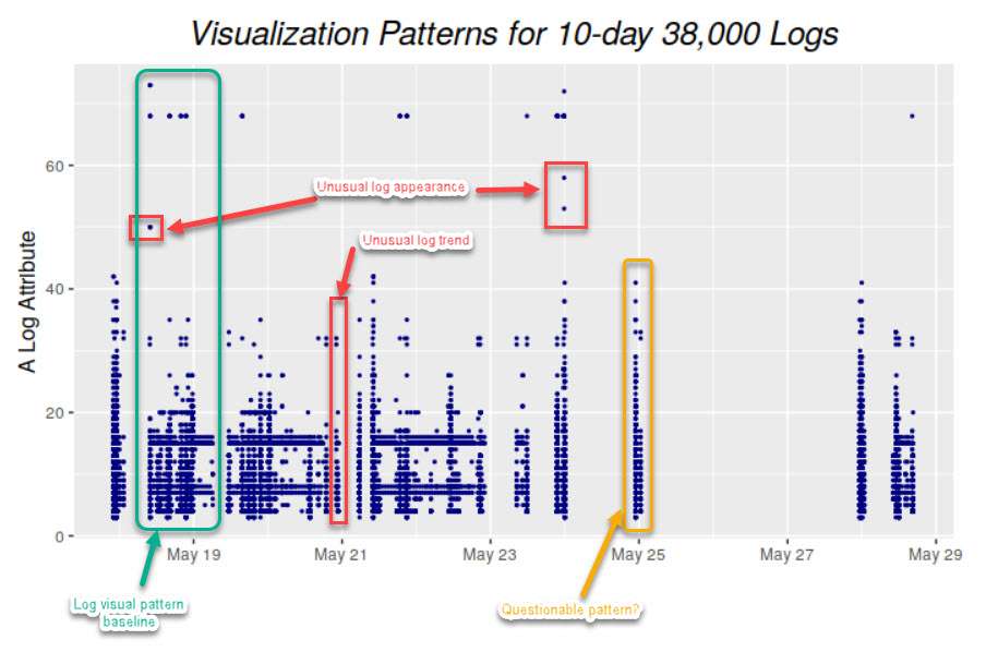
Once we plot logs daily on a graph, we can immediately figure out the baseline by observing it visually. Once we’ve visually established a baseline, we can instantly identify anomalies when we see values plotted above or below that established baseline. The following image visualizes logs ingested over ten days, illustrating how simple it is to establish baselines and identify when a system is doing something outside its usual behavior. This graph can deduce the baseline to be around 38,000 log records, with anything above denoting abnormal behavior within the system.

Better Log Visualizations
There are a few essential criteria for creating good log visualization analytics. They are:
- Use original log data. Data strategy is important. Most log data is unstructured by default, and many organizations tend to structure it before doing anything else with it. Doing so is a mistake, as you can lose vital pieces of information in the process. Good visualizations should be based directly on the logs exactly as the system produces them.
- Log data consistency. The format for the visualization should be consistent because if there are constantly changing variables, it becomes harder for humans involved to spot patterns.
- Choose robust log attributes and use them wisely. Instead of using just one log attribute for visualization (such as time distributed log density), you should look at visualizing more facets. Doing so gives analysts a better grasp of—and an intuitive understanding of—the log data set. For example, multiple pictures of an elephant taken from different angles help people understand elephants better than showing them only a single photo of an elephant taken from one angle. Similarly, if we break down logs by each of their attributes and then plot their frequency, we can better visualize how a system is performing. However, the attributes you pick are critical to providing valuable visualizations.
With modern systems becoming even more complex, deciphering logs and uncovering unknown-unknowns will never be easy. The time is right to introduce new log visualization techniques to handle these unknown-unknowns. With log visualization becoming more user-friendly, you no longer need to count on people to be familiar with log interpretation or be aware of statistical, mathematical or AI techniques to analyze log data. Visualizing log data is not just a decision-making aid to human intelligence, discriminating between what is and isn’t acceptable and quickly identifying and remediating issues—the knowledge gained from unraveling the unknown-unknowns also helps advance AI/ML and automation techniques used to ascertain the knowns of your log data.


