
Log data contains tons of information – the more complex the system producing the logs, the more information the logs have. Imagine going through endless lines of log data to find an event that’s of interest to you. Not only is it going to sap away a lot of your time, but it’s also going to exhaust you mentally. Now imagine if you could instead visualize the occurrences of any particular event within your application or infrastructure as a time series just by plugging in your log stream.
Apica lets you do just that. With Apica insights, you can generate time-series visualizations for events that matter for effective monitoring. You can also create a dedicated dashboard for visualizing your log data to get to them instantly. This article takes you through how you can visualize your log data using Apica. If you haven’t already installed Apica, you can get started for free, forever, with the Apica PaaS Community Edition. This tutorial assumes you have access to a Apica instance that is already ingesting your log data.
Creating a dedicated dashboard
Let’s begin by creating a dedicated dashboard for the visualization we’re setting up. The dashboard you create neatly organizes all of your visualizations and saves you from searching for your log visualizations when you need them.
To create a dashboard, do the following:
- Log into your Apica UI.
- Click Create > Dashboard.
- Name your dashboard and then click Save. In this example, we’ll name our dashboard EventTimeSeriesChart.
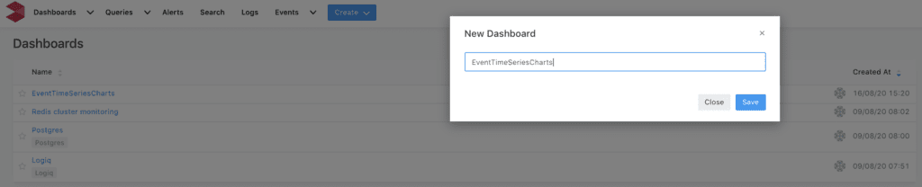
Your new dashboard is now ready to house the visualization you’ll create in the next step.
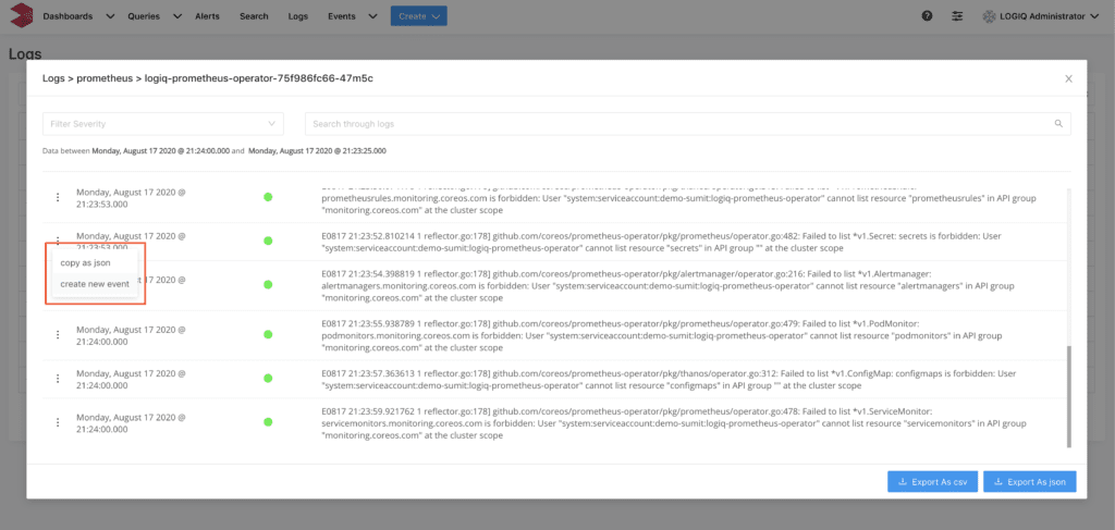
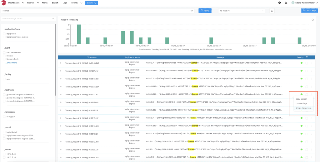
Looking for a log-line of interest
Now that your new dashboard is ready, let’s find a line of interest from a log to create an event. In this example, we’re trying to visualize the number of lookups for the license installed within an application. For this, we’ll search for the occurrence of the string “license” within our log data. You can look for logs using either the Logs page or the Search tab on the Apica UI. To look for a log-line of interest, do the following:
- Use the search bar within the Logs or Search pages to search for your term of interest. The search results will display all logs that contain the phrase you searched for.
- Click the three dots menu next to a log-line of interest and then click create new event, as shown in the following images.

Searching for logs using the Logs page 
Searching for logs using the Search page
Doing this opens the Create alertable event rule modal window.
Creating a new event
The Create alertable event rule modal window enables you to create an event rule, create a corresponding visualization, and optionally create an alert trigger. Apica generates events when a log-line satisfies the criteria for an event rule. An event rule consists of a list of key, operator, and value combinations that you could connect using AND conditions. Each combination consists of standard parameters such as Message, Application, Severity String, Facility String, Sender, and optional facet parameters specific to that log-line.
The following image depicts an example of how to configure the new event rule.
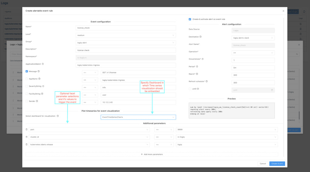
As you can see in the image above, we’ve selected the dashboard named EventTimeSeriesChart we created in the previous step using the Select dashboard for visualization dropdown menu. You can optionally configure an alert whenever a log-line matches this event rule.
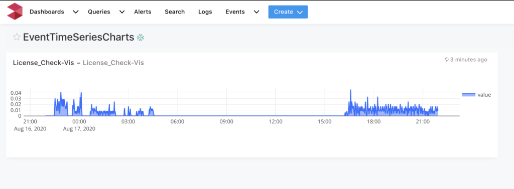
When you click the Create Event button, Apica generates an event rule, time-series event visualization of the query, and an alert trigger, if configured. Based on the above configuration, Apica generates an event whenever a log-line matches the regular expression “GET /v1/license” and meets the other additional query parameters configured in the alert. Apica then records each triggered event in the time-series database and generates a visual graph of the frequency of occurrence of these events.
Viewing the time-series visualization
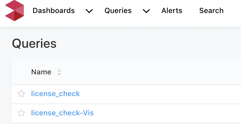
The queries Apica creates for the newly-created event go straight to the Queries page on the UI, as shown in the following image.
Since we’ve already created a new dashboard to house the time-series visualization for our event, you can directly access it via the Dashboards tab on the Apica UI. Selecting the dashboard from the Dashboard dropdown displays the visualization, as shown in the following image.
This completes the tutorial on converting your logs to time-series visualizations. You can follow the steps listed in this tutorial to create events based on various parameters from your log data and visualize them instantly.
Conclusion
Considering that logs are the only way for engineers to track and understand what’s happening in today’s complicated and distributed applications, visualizing log data goes a long way in helping them dive into parts of applications they don’t fully understand, spot anomalous activity, and remediate issues faster. If you aren’t visualizing your log data already, you can start doing so instantly by installing the free-forever Apica PaaS Community Edition. You can also reach out to us if you’d like to know more about how Apica can help improve observability of your applications and infrastructure at scale across public, private, and hybrid clouds.


